From Paper to Digital: Four Stages Cut to Three
TL;DR
UX Designer
4 week
In UAT
Under NDA.
Project details have been withheld or altered. Design work, reasoning, and screens shown are my own.
A paper trail with no visibility, and no guaranteed end
The client's approval process ran entirely on paper. A single request for extra staff, training enrollment, or a credential. This could take up to two months, with no visibility into where it sat. Requests often bounced back after months of waiting, forcing people to start over.
The brief
A digital system that moves a request cleanly through approval levels, shows everyone where it stands, and meaningfully cuts decision time.
Who needed what
Frontline & branch staff
Needed a simple way to submit a request and see its status without chasing anyone for an update.
Approvers
Needed to review and act on requests quickly, often from a phone, with enough context to make a fast call.
Top-level Approver
Needed oversight across the whole organization like budget context, reporting, and ability to sanction larger requests.
Designing the chain, then cutting it
The first version mapped the digital chain onto the existing management hierarchy: local review, mid-level check, senior admin, final sign-off. Four stages for four levels of authority.
That mapping felt correct. The hierarchy existed, the chain existed, so the design copied it.
But when the prototype was reviewed, feedback was
the third stage wasn't adding a decision the chain didn't already have
It was a handoff, not a checkpoint.
So I rebuilt the flow with three stages instead of four, collapsing the redundant step. The logic shifted from “mirror the org chart” to “capture only the points where decisions are truly made.”
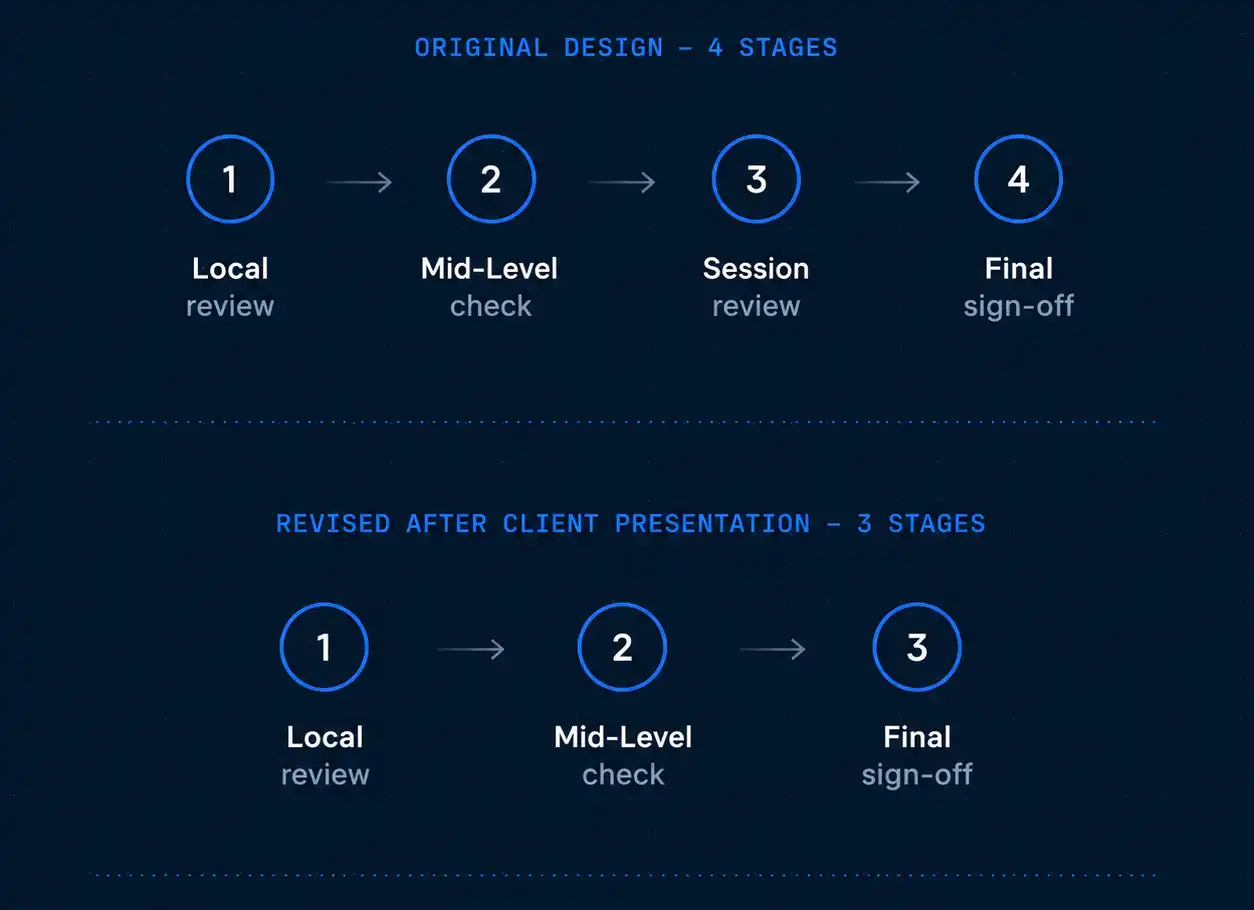
Every request type now follows the same three-stage chain.
Personnel quota
Personnel selection
Training enrolment
Authority cards
Removing one stage cut handoff risk by a quarter and shortened a process that used to have no predictable end.
What the role covered
// Workflow architecture
This covered the end-to-end logic for how a request moves through the system
What happens at each stage
Who can act
What they see
What happens on approval, rejection, or escalation
The logic is shared across all four request types, so a user only has to learn the pattern once.
// Information architecture
Early versions of the navigation mixed "make a request" and "review a request" in the same place, which was confusing for users who did both. After testing a few arrangements, I restructured the sidebar into a clear split.
Applications
Submitting and tracking your own requests
Approvals
Acting on requests waiting on you
// Cross-platform interface
Mid‑level approvers use phones, top‑level and admins use desktop. I designed actions to work cleanly on both — no desktop clutter forced onto mobile.
// Role-scoped views
Each approval level sees only the information relevant to its decision.
Local-level reviewers
Operational context
Top-level approver
Budget and organization-wide visibility
The scope of what each role sees was part of the design; the underlying permissions system was built by the development team.
Screen
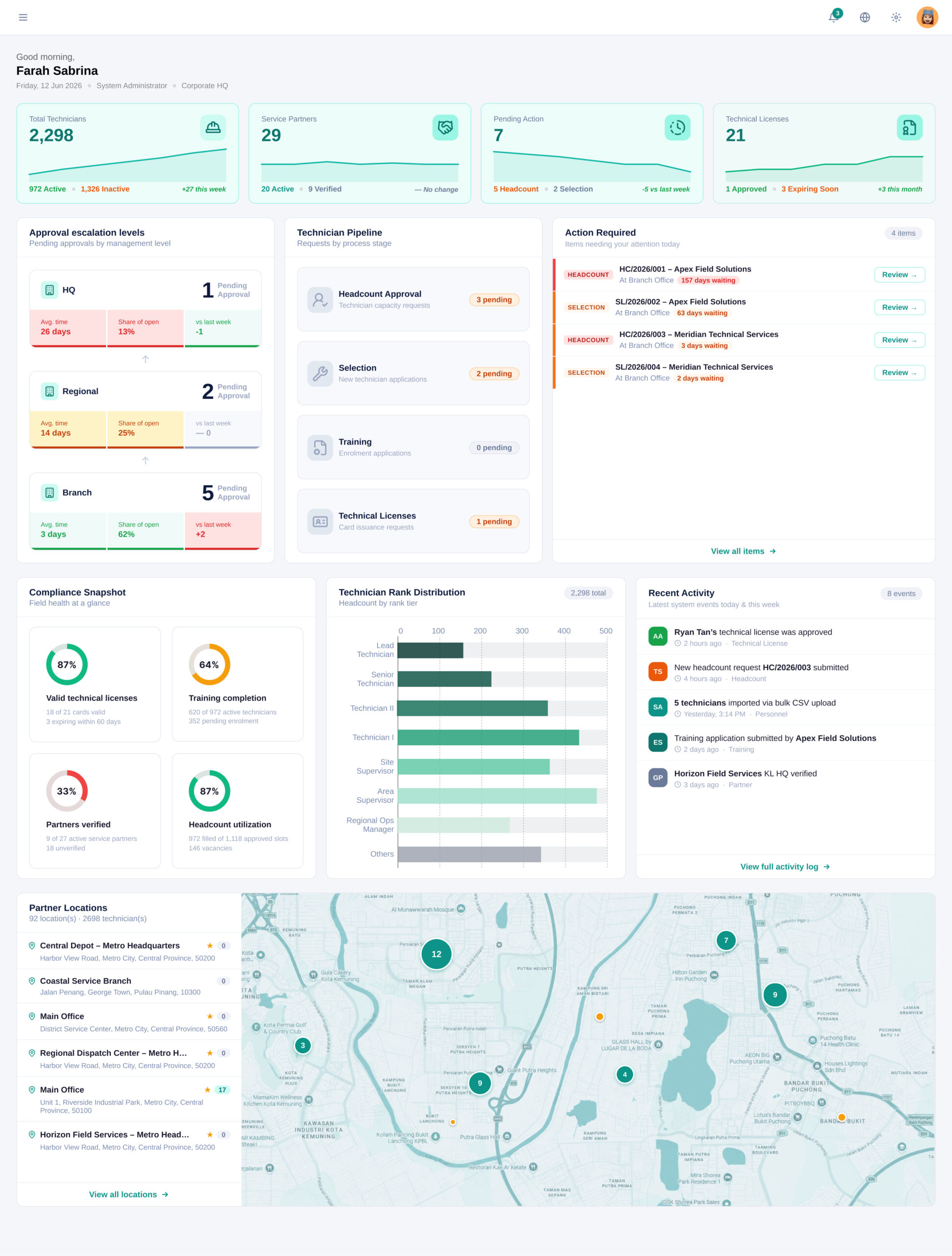
The prototype won the project. The target is a 75% reduction in approval time.
Won the project
The prototype, revised three-stage workflow, and a high-fidelity build was enough to secure client sign-off and move from pitch to commissioned project.
Cut a stage, system-wide
Moving from four stages to three removed a non-decision-making handoff from every request in the system, permanently.
The 2-week target hasn't been tested against real volume yet as the system's in UAT. But it's not a guess; it's the direct result of cutting a non-essential handoff.
Still in the loop, post-handoff
One example: internal review found the dashboard's first version didn't help users see what needed attention. I redesigned it around actionable information instead.
What copying the org chart gets wrong
The easy version of this project was copying the paper hierarchy straight into a digital form, four levels, four stages, done. What mattered was realizing the system needed to copy the decisions, not the hierarchy. That gap only became visible in front of the client, not during my own review.