Designing a fleet system after the last one failed
TL;DR
UX Designer
Signed
Figma · Claude Code
Under NDA.
Project details have been withheld or altered. Design work, reasoning, and screens shown are my own.
The client wasn't starting fresh. They were starting after a failure.
Before this project, the fleet team did most of their work by hand. Using spreadsheets, phone calls, manual fuel and toll claims. Two problems pushed them to look for a new system:
No visibility.
There was no live map. Managers had no way to know where a vehicle, or a driver, actually was.
The old reporting tool didn't work.
Staff create and submit reports every week. Fuel summaries, driver scorecards, trip reports. It's not optional, it's part of the job.
That second problem mattered most. This wasn't a fresh start, whatever I designed had to fix the exact thing that made people stop using the last tool.
Same fleet, two different jobs
Two kinds of people needed this system, and they needed to see different things.
Operator
Manages the whole fleet. Need the full picture for vehicles, drivers, and maintenance.
Dispatcher
Needs to know what's ready to go out right now. Not the whole fleet, just today's work.
The real design question wasn't "what should this tool do." It was "who needs to see what" so each screen only showed what that person needed to act on.
Fixing what the last tool got wrong
But the old tool already had every report type
Over 25 of them, all in one long list. The problem was never "missing reports." It was that nobody could find the one they wanted in that list.
So instead, I built a simple 4-step guided flow.
Step 1
Search or pick a category.
Step 2
Choose the report's details.
Step 3
Pick the format and schedule.
Step 4
Review and generate.
One long list became a short, guided path.
Constraint
I didn't get to test this with real users as there wasn't time in the proposal stage. The design was validated with 6+ stakeholders at the client, and their approval helped win the contract. But stakeholder approval isn't the same as staff using it daily. That's the part I'd still want to check if the project resumes.
A map dot shows "where." It doesn't show "how."
But a dot on a map only tells you where a vehicle is.
It doesn't tell you how it's being driven, or if it should even be there. The client's real concern was:
Harsh driving
Unsafe behaviour
Personal use of company vehicles
So I added AI camera alerts alongside the live map.
The system flags harsh driving, no seatbelt, and driver fatigue on top of speed and geofence alerts. The map shows where. The AI shows how, and whether that's okay. This also matched what the company is known for which is AI and tech. This made it a stronger pitch than GPS alone.
Screens
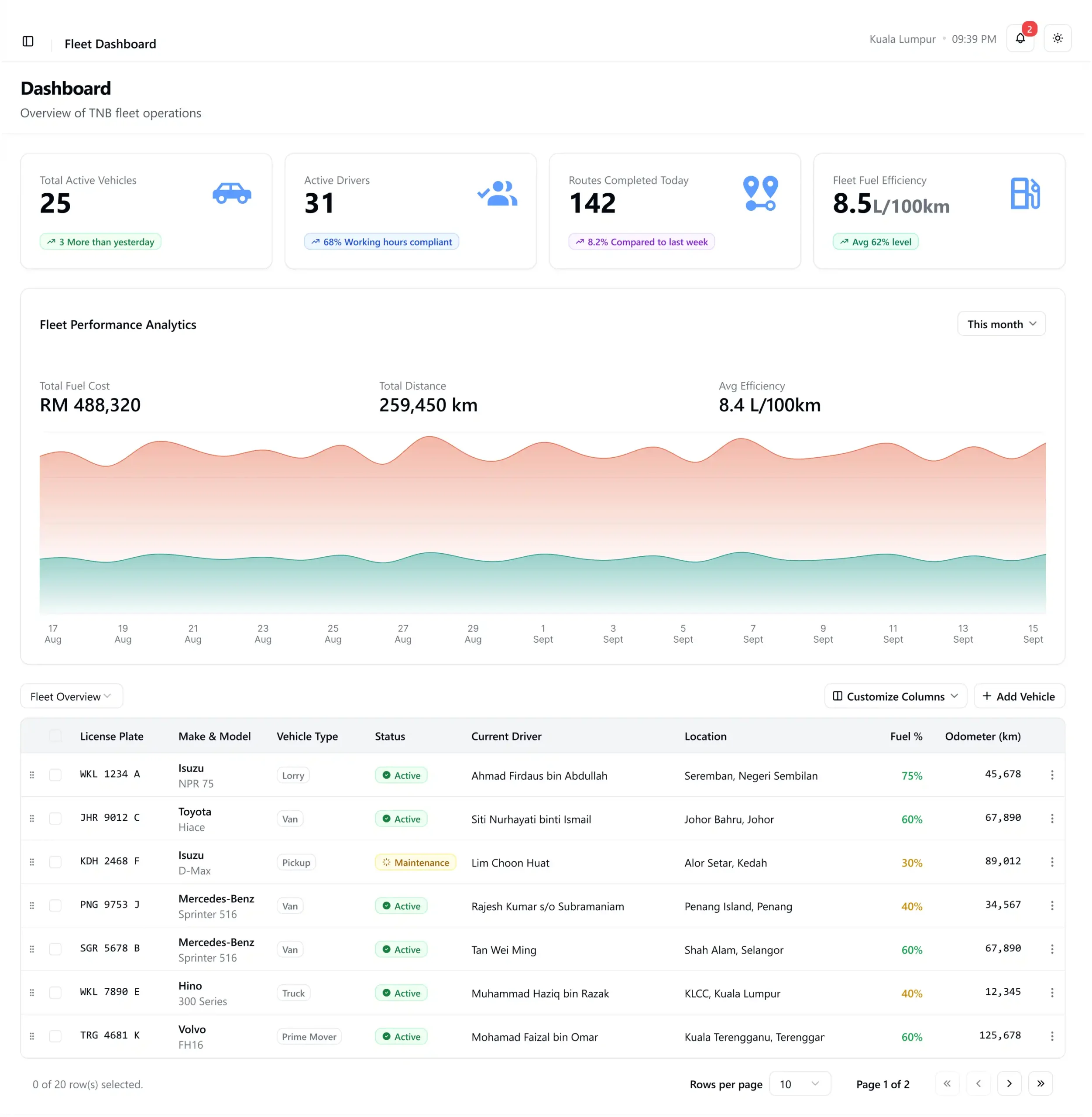
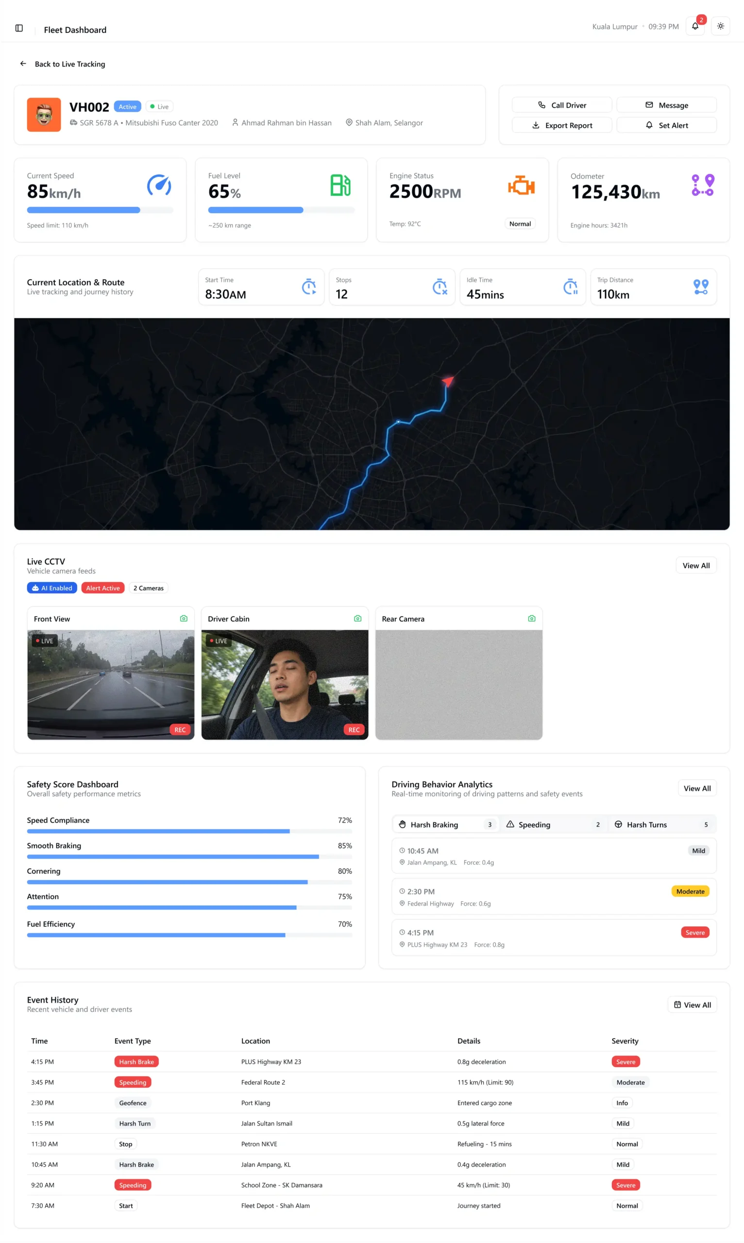
The proposal secured the contract. The project paused after POC.
Signed
Contract secured from proposal work
20 / 3
Vehicles · Branches in POC
Paused
Status after POC, reason unknown
The project didn't progress past this point, so I don't have production data. The design work secured the client.
What I'd want to know now
Stakeholders approved the design in a room. That's not the same as staff actually using it every day.
If the project starts again, here's where I'd start
The report tool
I'd want to test with real staff doing their actual job.
Does the 4-step guided flow actually help field staff find what they need faster, and does it hold up under the full range of report types they'd actually request?